- Loading...
Author: Jindrich Dinga
1. Introduction
This document is the user experience specification for the JavaFX TextBox (single/multi-line) control for Embedded. It is based on the original specification and describes differences between behavior of TextBox on Desktop and Embedded Touch.
2. Interaction Design
A TextBox is a rectangular space where users can type single or multiple lines of text. In order to enter characters into a TextBox on Embedded, users must use a virtual keyboard.
Interaction with a TextBox is basically same for all platforms. The only difference is in navigation and text selection. For more information, see the following chapters.
2.1 Touch
On Touch platforms, users use their finger to navigate within a TextBox. Users usually tap a place within a TextBox to place caret to a new position. If caret is not placed in desired position, users must be able to adjust it by dragging the caret or its handle.
Figure 1 Caret's handle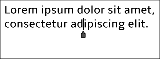
To select a word, users must double tap the word. After that the selection appears showing handles that allow users to adjust the selection.
Figure 2 Selection
To perform common actions, such as Cut/Copy/Paste/Select/Select All users can tap and hold their finger down for a while to invoke a pop-up menu. Actions that are displayed in the pop-up menu are context sensitive.
If there is nothing in the clipboard, the pop-up menu shows Select and Select All actions when no text is selected or Cut, Copy, and Select All actions in case of a selection. If users choose Select action, the word closest to the caret is selected and a pop-up menu with Paste (if applicable), Cut, Copy, and Select All actions shows immediatelly. Similarly, if users choose Select All action whole text is selected and a pop-up menu with Paste (if applicable), Cut, and Copy actions shows immediatelly. In addition to that, handles appear at the beginning and end of the selection.
Figure 3 Pop-up menu w/ nothing in the clipboard (caret and selection)
In case there is something in the clipboard, the pop-up menu shows Paste, Select, and Select All actions when no text is selected or Cut, Copy, Paste, and Select All actions in case of a selection.
Figure 4 Pop-up menu w/ something in the clipboard (caret and selection)
To delete selected character/text users must tap DELETE key on the virtual keyboard.
Please note that the pop-up menu is always displayed in such way so it is always visible on the screen. It can be displayed above or below the selection/caret.
Note that Touch devices can rotate. Because of this, sizes of TextBox should adjust automatically based on the available mode (Landscape or Portrait).
2.2 Password Field
Please note that behavior of PasswordField UI control is described in the following specification.
On Touch and 2D platforms, user interaction with a PasswordField is exactly the same as user interaction with a TextBox as described above in Touch and 2D chapters. The only difference is that in a PasswordField the following actions are not available on Touch platform: Cut, Copy, and Select All.
3. Navigation
The following table describes what happens when users use the following gestures:
| Action | |
|---|---|
| Tap | Place the caret. If content is scrolling, stop scrolling. |
| Double Tap | Select the word. |
| Hold and Press | Show pop-up menu. |
| Drag the Handle | [Caret only] Change position of the caret. [Selection only] Include/exclude text from the selection. |
| Swipe from top to bottom | Invoke accelerated scrolling of content up. The initial scrolling speed is defined by the swipe gesture intensity. It continuously slows down until it stops. For more details on animation/velocity, see ScrollView UE Spec. |
| Swipe from bottom to top | Invoke accelerated scrolling of content down. The initial scrolling speed is defined by the swipe gesture intensity. It continuously slows down until it stops. For more details on animation/velocity, see ScrollView UE Spec. |
| Drag | Scroll the content continuously following the drag gesture. The content moves exactly the amount of pixels indicated by drag gesture in vertical direction. The user can "over-scroll" the content by dragging it beyond the TextArea border. The content moves the half number of pixels of the drag gesture. |
| Drop | When the user "over-scrolls" the content beyond the TextArea border, drop gesture releases the content and it smoothly returns to the border of the TextArea. In normal circumstances, drop gesture just stops scrolling. |
The following table describes what happens after users tap the following actions that are available in the pop-up menu:
| Action | |
|---|---|
| Cut | Remove selected text from the TextBox and place it into the clipboard. |
| Copy | Copy selected text into the clipboard. |
| Paste | Paste text from the clipboard into the TextBox. Text is placed on the right side of the caret. |
| Select All | Select all text in the TextBox. |
Overview
Content Tools