- Loading...
Author: Maya Venkatraman
The first section in this document describes the parts of the tree controls and its salient states. The second section looks at the behaviors, actions and patterns that this control should support. The third section discusses how to make all the parts and actions within the control accessible by keyboard.
1.1 CHARACTERISTICS of a TREE CONTROL
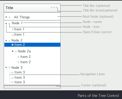

A tree control is a visual representation mechanism for a data set with a tree structure.
A tree control has nodes that can be opened and closed
Nodes contain child elements.
Nodes can contain other nodes.
Nodes that do not contain other nodes are called leaf nodes.
Nodes that share a common parent are called siblings
The first node in the tree can be a parent node to all the other nodes in the tree. (It should be possible to hide the root node in the Tree control UI)
Nodes have a "turner" - an icon that clearly indicates that these elements can be opened and closed. Leaf nodes should not have these "turner" icons.
Nodes can also have icons other than the turner icon:
- Lazy Evaluation Icons: Lazy Evaluation Icons are also called spinners. They appear either in place of the turner icons or after the name of the node name to indicate that information about that node is still being retrieved from the system. For more on this topic please see: "Show Loading Data"
- Node Icons: These appear to the left of the node name. Clicking on this icon selects the node. Multiple node icons should be supported. It should be possible to set tool tips for these icons.
By default a custom tree cell should provide one Icon and Node Name text. In addition, it should be possible for the application developer to add a checkbox and at least two more icons for each node.
- Tree controls may have Title area. Title areas, if present should have title text. The Title Area may also have Toolbar. The toolbar will contain a set of icons that trigger actions that apply to the entire tree such as : open all, close all, global refresh icon.
[Issue.Tree.2: It is possible that the title bar is may be implemented as a separate control that can be added on to controls such as the tree, table, tree-table, accordion and list.] - Tree nodes can be in a neutral state, selected state, edit state (where the text label is being edited inline) hover (or armed) state. Tree nodes can also be in a state where they are selected, but the tree control does not have focus (for instance, master-detail pattern, the application user has clicked on a tree node to reveal a details pane, and then clicked on an element in the details pane, the selected item on the tree is now selected, but the tree control does not have focus.) A tree with a selection and has focus should have "primary highlighting" to show selection. A tree with a selection but *not* having focus should show "secondary highlighting" for the selection. These states apply to root, parent, child, leaf node in both the open and closed states. On touch platforms, the nodes can take on a state to indicate that they were just touched to be selected.
- While accordion controls have nodes that can contain a variety of things including images, text, media etc. a tree control, typically only allows for other nodes to be contained inside a node.
1.2 Input Actions Associated with Parts of the Tree Cell

- It should be possible for the application developer to override the actions mapped to one of the areas
- It should be possible for the application developer to easily specify what a mouse action (say click) should do across the entire cell.
- Some platforms that have dedicated gestures for scrolling (such as the flick gesture in touch platforms). In such cases, these specific gestures should be supported.
- Note: There is some ambiguity in terms of how the white space is treated. As seen in the above diagram, we propose that by default clicking on the white space should select the node. Clicking on the whitespace and dragging should start a panning action (in addition to selecting the node).
2. COMMON BEHAVIORS and ACTIONS
2.1 Nodes should Open and Close

- The control should be able to support smooth animation during open and close.
[Parameters : Speed with which the animation for the open and close of the node, type of animation] - Tree component does not need to support the case where only one node is open at a time
- Applications may want to auto-open nodes with only one child node. The tree control itself should make this feasible. Implementation team may consider an attribute that the application developer can set to easily trigger this behavior if needed.
- By default the tree should remember expanded nodes and reopen in its prior state. Applications may want to:
- always reopen the tree with all the nodes closed & scrolled to the top,
- always reopen the tree in another state specified by the application developer or
- always reopen the tree in its previous state. Application developer should be able to specify one of these settings
The default state, where the application developer has not specified anything additional should map to a state where the expanded nodes are remembered.
2.2 The list component should be able to support horizontal and vertical scrolling

If a scroll bar is present, then the item with focus should be in the visible window, unless the the user explicitly scrolls off the view.
Scrolling should cause entire lines to appear or disappear from the viewable area (we should not see partially displayed row of text)
- In case the node name does not fit in the viewable area and has been truncates (and a horizontal scroll bar is presented), hovering over the node should bring up a tool tip with the entire node name
- When tree nodes are being opened the tree should scroll horizontally to ensure that the first few (7- 9 ?) characters of the newly visible child-nodes are in the view screen
- If a tree node is selected and then the tree is resized, the selected item should stay visible during and after the resize.
2.3 Should be able to select one or more items

- Should be able to select items by clicking
- Should be able to select multiple items
- Should be able to select multiple discontiguous items
(keyboard and selection conventions should be the same as those for the list spec.) - Should be able to have checkboxes in front of the node name, in order to facilitate selection
- UX rational: Sometimes need to incrementally "mark" nodes for other operations - more convenient than normal selection for later batch operations. This makes multi select via keyboard much simpler for users.
2.4 The tree control should support customized context menus when right clicking on a node

Sometimes, in addition to the right click menu (or instead of it) these actions are invoked via a pull down menu placed in the Title bar of the tree control. Actions may also be shown as buttons, icons or links in the cell that are revealed on hover (or mouseover).
UX Rationale for contextual menu: Common UX usage that needs to be supported
2.5 Should support Drag and Drop of nodes

- Nodes or elements can be dropped into other locations in the tree
- Nodes or elements can be dropped on to other locations in the UI outside the tree (where the drop action is appropriate, if the drop action is not appropriate for a certain area, the cursor should change into a stop cursor).
- The tree should provide drop feedback. By default it should disambiguate exactly which node the content will drop into. Application developers should be able to further customize this into cases where they want to convey that a certain node does not work as a drop-site or cases where they want to allow content to be dropped between two nodes (so that a new node is added at that location).
Usage Note: Drop action can result in Copy, Move or other outcome (such as connect or apply). The tree control itself should not in any way prevent an application from using all such semantic outcomes from the drop action.
2.6 Showing loading data (locally and globally across nodes)
The tree component may need to convey to the user that the data in the tree is still loading. This can be at the level for the child node, parent node, several nodes, or globally. Spinners are animated icons shown when parts of the tree is still loading. Several cases are illustrated in the mock ups here:

Note: The child nodes need to be shown as spinners only if there is a lag in determining the exact icon to display. The appropriate icon should be shown as soon as it is available.
- There can be nodes that show the spinner while others do not.
- For any given node, only one spinner icon is presented at a time.
- Since users may want to open and close nodes while the loading spinner is being displayed, it may be desirable to have the icon / spinner indicate that this is possible The control itself will have to support the use case where the node is in the process of opening and the user clicks on the icon again, it should now close.
2.7 Adding, Removing and Changing Properties of Nodes
The tree component should have in place all the functionality that can support an application that will need to support users changing properties associated with nodes, adding nodes or removing nodes.
2.8 Inline Editing of Node Names
On some platforms, users will be able to make a gesture (double click , or click and pause) to indicate that they need to edit the node text. The node will assume the editable state and the user will be able to edit the node name inline. When the edit task is completed the user will click enter to return to normal mode. This should be supported by the default tree custom cell and the cross-component specification for custom cell may cover more details.
2.9 System generated changes in focus - best practice
The tree control should be able to support application developers who want to use a system generated change in the focused node. If the system causes the focus or selected item on the control to change, the application developer should be able to show the end user that the new tree-node that has focus. It should be displayed in the view area of the tree, and all the nodes that contain this node should be expanded or opened out so that this node with the selection is visible. A RIA interface should use animated transitions to clearly convey such a change to the user.
2.10 Custom Highlighting of Nodes
It should be possible for the application to highlight an arbitrary node or nodes. For instance, if the user searches a tree, all the hits in the search will need to be highlighted. The component should make it possible for the application developer to do this.
2.11 Sorting
The tree component should support the ability for the app to sort the nodes in some orders (alpha, order of creation, or by some other node-property)
3. KEYBOARD NAVIGATION
Main Control Actions and how to invoke them via the keyboard:
The main tasks that users will need to do within the tree component (and therefore the tasks that will have to be supported by keyboard access are:
- Moving through the nodes of the tree
- Opening and closing nodes
- invoking the right click menu
- skip between sections of the control (title bar, body and footer)
The diagram and table below discuss how these actions can be performed using the keyboard and tab traversal. After that we look at the mobile and TV platforms.

| Keyboard Operation (Win) | Keyboard Operation (Mac) | Action |
|---|---|---|
| Right Arrow | Right Arrow | Expand current selection (or go to first child node) |
| Left Arrow | Left Arrow | Collapse current selection (or go to parent node) |
| Up Arrow | Up Arrow | Move selection up one node |
| Down Arrow | Down Arrow | Move selection down one node |
| Home | Home | Move selection to the first node in the tree |
| End | End | Move selection to the last node in the tree |
| Page Up | Page Up | Move the selection up on the first fully visible item on the current page. If the first fully visible item is selected, move the selection on the first fully visible item on the previous page. |
| Page Down | Page Down | Move selection down on the last fully visible item on the current page. If the last fully visible item is selected, move the selection on the last fully visible item on the next page. |
| Ctrl-PgDn | Cmd-PgDn | Move focus down on the last fully visible item on the current page. If the last fully visible item is focused, move focus on the last fully visible item on the next page. |
| Ctrl-PgUp | Cmd-PgUp | Move focus up on the first fully visible item on the current page. If the first fully visible item is focused, move focus on the first fully visible item on the previous page. |
| Ctrl-A | Cmd-A | Select all nodes in the tree. Focus remains on the same item. |
| Shift-Up Arrow | Shift-Up Arrow | Extend selection up one node In single selection mode, Shift key should be ignored and only Up Arrow key should be processed. See description of Up Arrow behavior for more details. |
| Shift-Down Arrow | Shift-Down Arrow | Extend selection down one node In single selection mode, Shift key should be ignored and only Down Arrow key should be processed. See description of Down Arrow behavior for more details. |
| Shift-Home | Shift-Home | Extend selection to the top of the tree In single selection mode, Shift key should be ignored and only Home key should be processed. See description of Home behavior for more details. |
| Shift-End | Shift-End | Extend selection to the bottom of the tree In single selection mode, Shift key should be ignored and only End key should be processed. See description of End behavior for more details. |
| Shift-PgUp | Shift-PgUp | Select all items between anchor and the first fully visible item on the current page. If the first fully visible item is already included in the selection, extend the selection to the first fully visible item on the previous page. In single selection mode, Shift key should be ignored and only PgUp key should be processed. See description of PgUp behavior for more details. |
| Shift-PgDn | Shift-PgDn | Select all items between anchor and the last fully visible item on the current page. If the last fully visible item is already included in the selection, extend the selection to the last fully visible item on the next page. In single selection mode, Shift key should be ignored and only PgDn key should be processed. See description of PgDn behavior for more details. |
| F2 | F2 | Rename selected node |
| Enter | Enter | Save changes made to the selected node |
| Esc | Esc | Cancel changes made to the selected node |
| Ctrl-Up Arrow | Cmd-Up Arrow | Move focus up one node |
| Ctrl-Down Arrow | Cmd-Down Arrow | Move focus down one node |
| Ctrl-Home | Cmd-Home | Move focus to the first node in the tree |
| Ctrl-End | Cmd-End | Move selection to the last node in the tree |
| Space | Space | Select a single node, create anchor. |
| Ctrl-Space | Ctrl-Cmd-Space | Select/Deselect a single node, create anchor. |
| Shift-Space | Shift-Space | Select a range of nodes In single selection mode, Shift key should be ignored and only Space key should be processed. See description of Space behavior for more details. |
| * (numlock) | * (numlock) | Expand everything |
| + (numlock) | + (numlock) | Expand current selection |
| - (numlock) | - (numlock) | Collapse current selection |
| Ctrl-Shift-Up | Cmd-Shift-Up | Expands selection up by one item. Only in multi-selection modes. In single selection mode, Shift key should be ignored and only Ctrl-Up (Cmd-Up) should be processed. See description of Ctrl-Up behavior for more details. |
| Ctrl-Shift-Down | Cmd-Shift-Down | Expands selection down by one item. Only in multi-selection modes. In single selection mode, Shift key should be ignored and only Ctrl-Down (Cmd-Down) should be processed. See description of Ctrl-Down behavior for more details. |
| Ctrl-Shift-Space | Cmd-Shift-Space | Selects all items between anchor and focused item. Focused item is also included in the selection. Create anchor. Available in multi-selection mode only. In single selection mode, Shift key should be ignored and only Ctrl-Space (Cmd-Space) should be processed. See description of Ctrl-Space behavior for more details. |
| Ctrl-Shift-Home | Cmd-Shift-Home | Selects all items between anchor and the first item. Available in multi-selection mode only. In single selection mode, Shift key should be ignored and only Ctrl-Home (Cmd-Home) should be processed. See description of Ctrl-Home behavior for more details. |
| Ctrl-Shift-End | Cmd-Shift-End | Selects all items between anchor and the last item. Available in multi-selection mode only. In single selection mode, Shift key should be ignored and only Ctrl-End (Cmd-End) should be processed. See description of Ctrl-End behavior for more details. |
| Ctrl-Shift-PageUp | Cmd-Shift-PageUp | Select all items between anchor and the first fully visible item on the current page. If the first fully visible item is already included in the selection, extend the selection to the first fully visible item on the previous page. In single selection mode, Shift key should be ignored and only Ctrl-PageUp (Cmd-PageUp) should be processed. See description of Ctrl-PageUp behavior for more details. |
| Ctrl-Shift-PageDown | Cmd-Shift-PageDown | Select all items between anchor and the last fully visible item on the current page. If the last fully visible item is already included in the selection, extend the selection to the last fully visible item on the next page. In single selection mode, Shift key should be ignored and only Ctrl-PageDown (Cmd-PageDown) should be processed. See description of Ctrl-PageDown behavior for more details. |
4. OPEN ISSUES
- Issue.Tree.1: It should be possible for the application developer to add a checkbox and at least two more icons for each node. This topic will be addressed in a more detailed manner in the horizontal (or cross-control) specification for custom list cell for each node to address very common UX use cases. We would suggest having at least one list cell implementation that can meet these requirements "out of the box".
- Issue.Tree.2: It is possible that the title bar is may be implemented as a separate control that can be added on to controls such as the tree, table, tree-table, accordion and list.
Overview
Content Tools