- Loading...
Page History
...
Figure 1 - Placeholder only - actual visual design will be provided by our Visual Design team.

2. Overview
A ChoiceButton is a combination control that encapsulates a contextual Button for displaying the current selected item and opening a popup list which contains one or more user-selectable items.
...
Figure 2 - Placeholder only - actual visual design will be provided by our Visual Design team.

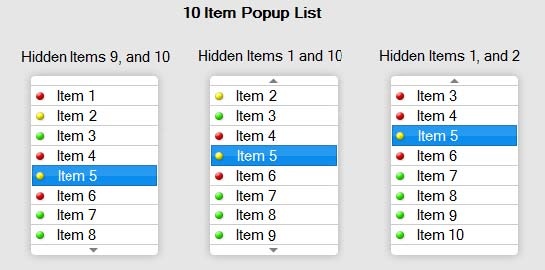
Hidden List items Exist
...
Figure 3 - Placeholder only - actual visual design will be provided by our Visual Design team.
Separators
The ChoiceButton Popup List should support Horizontal Separator Lines. The highlight should never stop at a separator, but should always jump immediately to the item on the other side of that separator.
...
Figure 4 - Placeholder only - actual visual design will be provided by our Visual Design team.

Blank Values and Indentations
...
Figure 5 - Placeholder only - actual visual design will be provided by our Visual Design team.
Non-Selectable Values
Values in the list can be set to not be selectable. This is often used for headers, such as Item 2 in the example picture above. These headers behave just like line item spacers in their not highlighting or being selectable.
...
Figure 6 - Placeholder only - actual visual design will be provided by our Visual Design team.

The image below illustrates utilizing various sized Thumbnails within the Control.
Figure 7 - Placeholder only - actual visual design will be provided by our Visual Design team.
Desktop and Mobile Touch Only - One-Step-Select vs. Two-Step-Select:
...
This section will provide a description of the states available for a ChoiceButton control with corresponding user actions. In JavaFX, certain transitions between state changes are used to enhance the user experience, for example graphical attribute or color fill fade-in and fade-out visual effects.
Normal/Enabled State
The Normal/Enabled State is when the ChoiceButton control is available for action. Color tone is medium gradient.
Figure 8 - Placeholder only - actual visual design will be provided by our Visual Design team.

Hover State
Upon placing the pointer over the ChoiceButton in a Normal State with the mouse or touch-pad, the color changes to a light gradient.
Figure 9 - Placeholder only - actual visual design will be provided by our Visual Design team.

Selected State
As the pointer is hovering over the ChoiceButton button, clicking (Press & Release) the mouse key or touch pad tap selects the Control and opens the Popup List. This is called the Selected State, and occurs with two-step selection.
Figure 10 - Placeholder only - actual visual design will be provided by our Visual Design team.
.
Armed State
While the mouse button is down, the list is considered "Armed", and releasing the mouse button while over a list item selects that list item. This occurs with one-step selection. There is no appearance difference in the list from the selected state, however.
Figure 11 - Placeholder only - actual visual design will be provided by our Visual Design team.

Disabled State
The Disabled state ChoiceButton is unable to be accessed or selected by any means and cannot be changed to any other state via mouse, keyboard or touch pad. The color/graphics is in a “Grayed-out” style. This state is typically used when a prerequisite user action is required to enable it, then it is changed to a Normal or Focused state.
Figure 12 - Placeholder only - actual visual design will be provided by our Visual Design team.

Focused State
Indicated with a colored frame surrounding the control, the Focused state is achieved either programmatically by design as a user affordance that is control requires immediate action, as a result of “landing” on it from another focused object through traversal navigation via the PC Tab and Up/Down/Left/Right navigation keys, (if the application provides such traversal functionality), or as a result of the user completing selection and remaining on the field.
The Focused ChoiceButton is a partially selected state whereby pressing the Enter key will immediately display the Popup List. The Focused state is additive, so depending on pointer location the Focused Button may also be in the Normal/Enabled, Hover, and Selected states. And so, hovering the pointer over a Focused ChoiceButton will change the button gradient to Hover while retaining the Blue Frame graphic which indicates Focused. If the user rolls the pointer off a Focused + Hover ChoiceButton (without selecting it) the control will revert back to the Focused + Normal/Enabled state.
In a Desktop application, the Focused Button is only displayed when the corresponding application window is selected (in-focus). Conversely, when the application on the desktop is NOT in focus, the control will be displayed in the Normal/Enabled State (without Focus graphical frame).
Figure 13 - Placeholder only - actual visual design will be provided by our Visual Design team.

Behaviors
Use of Mouse Wheel to Scroll Popup List in Selected State
Scrolling with the mouse wheel will scroll the list, but not change the selection. The selected value can even disappear from view.
Figure 14 - Placeholder only - actual visual design will be provided by our Visual Design team.

Keyboard Arrow Navigation
A user with can also press Space when on the focused button, arrow to the desired value, and then press Enter or Space again to select the desired value. Or they could do a hybrid of mouse and keyboard interaction, doing some part by touch and some part using the keyboard.
Scroll buttons
When the list is open (in the "Selected State"), hovering over a scroll arrow will change it to a hover appearance. Then selecting one of the Scroll Buttons highlights the button and scrolls the list in that direction. If the user clicks and releases the mouse quickly, the list scrolls one item in the direction of the Scroll Button Arrow. This can be done repeatedly -- users may use a “quick-click” toggling of the mouse key to quickly and continuously forward the list view one item at a time per the cadence of the clicking action.
Pressing and holding the mouse key down on the Scroll Button for at 0.5 seconds or more will invoke auto-scrolling of the list at a reasonable rate of speed for viewing (at about 2-3 items per second).
If the user is using one-step select, and drags the mouse pointer to or passed the scroll button while the mouse button is pressed down, that will scroll the list in that direction, allowing the user to select a previously hidden item. Once the item is visible, the user can move the pointer back up and release on the desired item, allowing the entire open-scroll-select process to be done in one continuous mouse-selection.
NOTE: This is a visual design change from what was spec'd earlier by Chuck, where the scroll arrow was highlighted when the mouse was held over it, and went back to white when the mouse button was pressed.
3-Speed Scroll Acceleration & Deceleration
When the user is on a scroll button and the mouse button is held down, the user then moving the Pointer off the button in the direction of the scroll accelerates the speed of the scroll through each of 3 speeds – reversing this action decelerates through each of the 3 speeds. (Reference Screen 5 and 6 in the flow diagram below)
- Pointer Position is Moved Slightly Beyond the Top or Bottom Most List Item to Scroll Button (1x Desistance) – Slow scroll speed (about 2 item scrolls per second). Allows user to easily see when the desired item is highlighted, then either releases the Mouse Key and clicks again to select, or continues to hold down mouse key and rolls pointer to desired list item and releases to select.
- Pointer Position is Moved Further Beyond the Top or Bottom Most List Item (2x Distance) – A Faster accelerated scroll speed (about 4 item scrolls per second). Highlighted items remain visible during scroll action, the user only needs to slide the Pointer slightly in the opposite direction of the scroll to easily slow-down the scroll speed then navigate to the desired list item – releasing the mouse key on the list item makes selection.
- Pointer Position is Moved Well Beyond the Top or Bottom Most List Item (3x or More Distance) – Rapid scroll speed to quickly reach the first/last possible list item. This is used for snapping to the Top or Bottom of a list. The user can then slide the Pointer back inside the popup list (the opposite direction of the scroll) to decelerate through the speeds then move the highlight to an alternate list item and release mouse key to select it.
Figure 15 - Placeholder only - actual visual design will be provided by our Visual Design team.

3.4 Desktop - Keyboard Support
...
Figure 16 - Placeholder only - actual visual design will be provided by our Visual Design team.
Selected State
Tapping (Press & Release) the ChoiceButton selects the Control and opens the Popup List. This is called the Selected State, and occurs with two-step selection.
Figure 17 - Placeholder only - actual visual design will be provided by our Visual Design team.

Armed State
While the finger is held down on the ChoiceButton, the list is considered "Armed", and releasing the finger while over a list item selects that list item. This occurs with one-step selection. There is no appearance difference in the list from the selected state, however.
Figure 18 - Placeholder only - actual visual design will be provided by our Visual Design team.

Disabled State
The Disabled state ChoiceButton is unable to be accessed or selected by any means and cannot be changed to any other state via mouse, keyboard or touch pad. The color/graphics is in a “Grayed-out” style. This state is typically used when a prerequisite user action is required to enable it, then it is changed to a Normal or Focused state.
Figure 19 - Placeholder only - actual visual design will be provided by our Visual Design team.
Focused State
Indicated with a colored frame surrounding the control, the Focused state is achieved either programmatically by design as a user affordance that is control requires immediate action, or as a result of the user completing selection and remaining on the field.
The Focused ChoiceButton is a partially selected state whereby pressing the Select key will immediately display the Popup List. The Focused state is additive, so depending on pointer location the Focused Button may also be in the Normal/Enabled and Selected states.
Figure 20 - Placeholder only - actual visual design will be provided by our Visual Design team.
Behaviors
The illustrations below shows the basic features and design of a Standard ChoiceButton with enlarged geometries and actions corresponding to touch screen interfaces. The behaviors are exact analogies to the desktop version described above.
...
Figure 21 - Placeholder only - actual visual design will be provided by our Visual Design team.

Flick Motion while in Two-Step Selection
...
Figure 22 - Placeholder only - actual visual design will be provided by our Visual Design team.

4.4 Touch - Keyboard Support
...
Figure 23 - Placeholder only - actual visual design will be provided by our Visual Design team.
Selected State
Pressing Select when on the ChoiceButton opens the Popup List. This is called the Selected State.
Figure 24 - Placeholder only - actual visual design will be provided by our Visual Design team.
Disabled State
The Disabled state ChoiceButton is unable to be accessed or selected by any means The color/graphics is in a “Grayed-out” style. This state is typically used when a prerequisite user action is required to enable it, then it is changed to a Normal or Focused state.
Figure 25 - Placeholder only - actual visual design will be provided by our Visual Design team.
Focused State
Indicated with a colored frame surrounding the control, the Focused state is achieved either programmatically by design as a user affordance that is control requires immediate action, as a result of “landing” on it from another focused object through traversal navigation via the Left/Right navigation keys, or as a result of the user completing selection and remaining on the field.
Figure 26 - Placeholder only - actual visual design will be provided by our Visual Design team.
5.4 2D Traversal - Keyboard Support
...
Overview
Content Tools