- Loading...
Page History
...
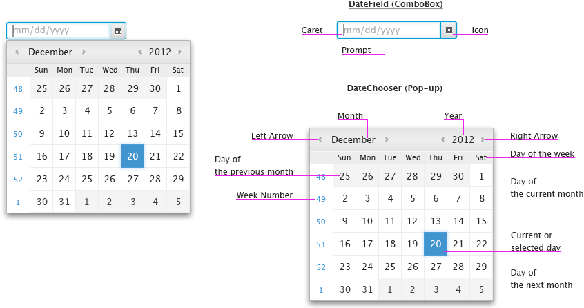
Overview of DatePicker Control

Please note that the title case should be used in case of months and days of week.
...
In addition, application developers must be allowed to modify the behavior in such a way so the calendar automatically pops-up when the field is focused.
DatePicker control


By default, the field does not contain any prompt text, however, application developers can implement it by themselves. If a prompt text is needed, it is recommended to get the required date format through API and display it as a
...
Example of DateField with a prompt

Note that every string that is used in the DatePicker control should be localized in all supported languages.
...
JavaFX DatePicker control is able to display various date formats based on user's locale.
Examples of date formats


Day Restriction
...
Example of a restricted day (12/22/2012)


Weeks of the year
...
Example of the calendar showing weeks of the year


Bidirectional Locales
...
Example of Islamic calendar


East Asia Calendars
...
Example of the calendar showing two months


Time
In some cases, application developers may require users to provide them with time. If so, application developers can enable showing controls that help users to enter the time into the field. These controls appear in the pop-up after a day is entered in the field.
Examples of date formats along with time


In addition to the time, it would be nice if application developers are allowed to enable showing a time zone drop down in the calendar.
Example of the calender showing the time and time zone controls


Please note that if users select 12h time format, AM or PM appends the time that is displayed in the field, e.g.11:28:28AM.
...
Example of the calendar showing an image


6. Navigation
Mouse - the following table describes actions that are performed when users click on:
| Date Field | Display caret in the field. When modified, the calendar may also pop-up. |
| Icon | Display/Hide the calendar. |
| LEFT Arrow | Display previous month/year. |
| RIGHT Arrow | Display next month/year. |
| Day | Update the field with selected date and close the calendar. |
| Outside the calendar | Close the calendar without updating the field. |
Note that when the mouse cursor is above the month or year, users may use the scroll wheel to scroll months or years.
...
Keyboard - the following table describes how keystrokes should be processed in case focus is in the calendar:
| ESC | Close the calendar without updating the field. |
| ENTER | Update the field with focused date and close the calendar. |
| SPACE | Update the field with focused date and close the calendar. |
| UP Arrow | If focus is on a day in a week, move focus to the same day in previous week. If focus is on a day in the first week of a month, move focus to the same day in the last week of previous month. |
| DOWN Arrow | If focus is on a day in a week, move focus to the same day in next week. If focus is on a day in the last week of a month, move focus to the same day in the first week of next month. |
| LEFT Arrow | If focus is on a day, move focus left by one item. If focus is on the first day of a week, move focus to the last day of previous week. If focus is on the first day of a month, move focus to the last day of previous month. In addition, update name of the month and days in the calendar. |
| RIGHT Arrow | If focus is on a day, move focus right by one item. If focus is on the last day of a week, move focus to the first day of next week. If focus is on the last day of a month, move focus to the first day of next month. In addition, update name of the month and days in the calendar. |
| PAGE UP | Move focus to the same day in the previous month. |
| PAGE DOWN | Move focus to the same day in the next month. |
| CTRL-PAGE UP | Move focus to the same day in the previous year. Use CMD-PAGE UP on Mac. |
| CTRL-PAGE DOWN | Move focus to the same day in the next year. Use CMD-PAGE DOWN on Mac. |
| HOME | Go to today. |
| TAB | Move focus to next focusable control. |
| SHIFT-TAB | Move focus to previous focusable control. |
Please refer to appropriate UE specs for the field , buttons, and pop-up menuand buttons.
7. Visual Design
Visual Design of DatePicker (Click to enlarge)


Overview
Content Tools