...
Please note that for Presidio release, we will implement DB-style table only. Other table styles, such as spreadsheet or properties-style table, are not part of this release. Because of that, features like cell or row spanning, grouped cells, or a selection in which all items that belongs to a rectangle formed by range's start and end points should be selected are not supported.
Figure 1 Table overview

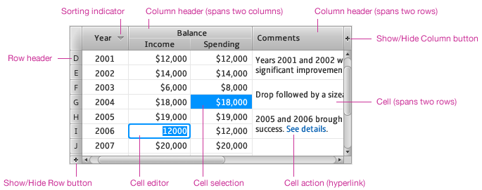
Table 1.1 Desktop Table features overview
...
Figure 2 Column header overview

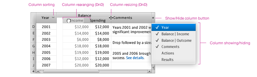
See detailed sections below describing sorting, and rearranging with resizing (not implemented in Presidio release). Column hiding and showing behaves like a regular menu button with check box menu items. See menu spec for details.
...
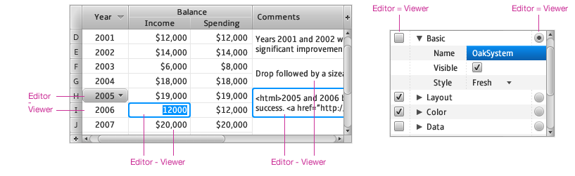
Cells display table content as labels, icons, check boxes or other standard controls. Custom cells are also supported. Cells support horizontal and vertical alignment, automatic sizing when cell width or height automatically fits content size, and multi-row and multi-column cells when a cell spans multiple columns or rows. Cell formatters display standard textual values in predefined style, in some cases corresponding to localization settings of native platform (e.g. date, time, numbers).
Figure 3 Cell overview


In addition to displaying values or information, cells can also be selected, edited or they can represent actions. Cell space is usually limited, therefore multiple clicks are sometimes necessary to differentiate between selection or editing. Possible pointing device click behavior after clicking into an unselected cell:
...
Figure 4 Selection overview


In multi-selection modes, one selected item (cell, row or column) is marked as a selection lead. It indicates the beginning of range selection when making range selection with pointing device (Shift-Click). For keyboard control, the selection lead is the focused item controlled with arrow keys.
...
Figure 5 Cell editor overview

If the same control is used for viewing and editing (e.g. check boxes or radio buttons) then cell editors are visible directly and it is not necessary to select the cell before using the editor. If a different control is used for viewing and editing, developers should have the following options:
...
Figure 6 Click to edit behavior (4 possible alternatives; note that the pink dot represents the left mouse click)


Please note that pictures above show the behavior of the cell editor for text boxes, and choice boxes only. Other controls, e.g. check boxes or radio buttons, have the cell editor visible directly so it is not necessary to select the cell before using the cell editor.
Normal - shows a cell in its normal state
Rollover - shows appearance of a cell when the mouse cursor appears over it
Selected - shows appearance of a cell which the user clicked on or hit Space on (after navigating to the cell using the keyboard)
Edited - shows the cell editor in action
...
If a table is empty, it permits developer to show a label or other content cross the whole table area. This is useful to explain why the table is empty.
Figure 7 Empty table
Sorting
Table permits the user to sort columns by clicking the table header and it visually indicates which column the table is sorted by. It also supports multi-column sorting. The user clicks on a secondary (or tertiary, etc.) sorting column while holding the Shift key down. All columns then show visual sorting indication.
...
Figure 8 Sorting overview


Table 3 Pointing device sorting behavior
...
Figure 9 Column resizing unconstrained


When the user resizes a column width in the constrained mode, the table automatically adjusts the width of the right hand side columns. When the user increases a column width, the table decreases the width of the rightmost column until it reaches its minimum width. Then it decreases the width of the second rightmost column until it reaches minimum width and so on. When all right hand side columns reach minimum size, the user cannot increase the size of resized column any more.
...
Figure 9.1 Column resizing constrained to fit table width


Filtering and searching
...
Figure 10 Filtering overview


Figure 11 Searching overview


Note: In Presidio, we'll be supporting table-wide filtering (aka searching), but not filtering on specific columns (at least, not in the sense that we'll be offering any kind of 'filter bar' as shown in figure 11). Table-wide filtering will have no UI - the developer will be responsible for creating the UI as necessary.
...
Figure 12 Pagination overview


Note: The UI for this feature is not part of Presidio release.
...
Overview
Content Tools
ThemeBuilder