...
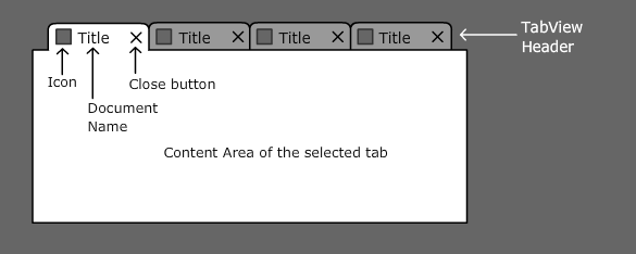
Figure: Basic parts of a TabView UI control

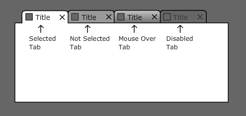
There are a few basic states of tabs. Tab can be selected, not selected, disabled, or it there is an visual effect when mouse is above the tab.
Figure: Basic states of tabs

3. TabView Interaction Design
...
- Show and hide icons, titles or close buttons if necessary. It can be different for the selected tab and other tabs (see image below). Other tabs than selected one can appear as minimized. There are visible just their icons without titles and close buttons.


Figure: Different appearance for the selected tab and other tabs - Different sizes of icons are supported.
- Display a Tooltip above tab. E.g. It can be used for detail description of the file opened in the content area or showing its path.


Figure: A tooltip above second tab - Support contextual menu invoked by right mouse click from a tab.Usually it contains actions related to manipulation with the tab or actions related to tab's content. These actions are typically visually separated.


Figure: A contextual menu above first tab - Tabs can be displayed on any side of the content area. Orientation of tabs can be the same (horizontal) or different.


- If there isn't enough space to show all tabs it has to be handled properly. Typically by showing arrows or full list of tabs next to the tabs.


- TabView can be nested in other TabView and then they behave as independent.


3.2 TabView - Advanced Features
...
- Show progress indication if tab's content is being updated. The progress indication can be shown instead of an icon inside the tab header. There can exist two versions of the progress indication (deterministic and undeterministic one).


- Possibility to expand or collapse tabs so user can do that manually if he wants. This can be used for finger tabs (see example below) or when user wants to see more of the content area.


- To be able to differentiate a nested TabView visually from the first one.


- Ability to automatically squeeze all tabs in a limited area. This is useful when tabs are clearly recognizable by an icon or by a few first letters of tab titles. The close buttons can appear either on selected tab only or just during roll over tabs.


- Mouse scroll button can work as a quick navigation among tabs that are hidden.
...
Overview
Content Tools
ThemeBuilder