- Loading...
Author: Jindrich Dinga
1. Overview
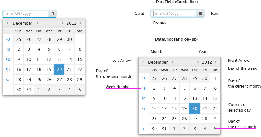
JavaFX DatePicker is a control that allows users to easily select a day from a given calendar. It is mainly used on web sites or in applications that require users to enter a date. The DatePicker control consists from a field (DateField) and calendar (DateChooser).
Overview of DatePicker Control
Please note that the title case should be used in case of months and days of week.
By default, the date format, day which week starts with, and language that is displayed in the JavaFX DatePicker control is based on user's locale.
2. Basic Functionality
When the DateField is focused, users are allowed to enter a date in the field by simply typing it in there. If calendar is needed, users can click the icon next to the field to invoke the DateChooser. When the calendar pops-up, the day that is selected is the current day (in case the field is empty) or day which users typed in the field. Once users click a day, the calendar is closed and the field is updated with that day.
In addition, application developers must be allowed to modify the behavior in such a way so the calendar automatically pops-up when the field is focused.
DatePicker control

By default, the field does not contain any prompt text, however, application developers can implement it by themselves. If a prompt text is needed, it is recommended to get the required date format through API and display it as a
- prompt text in the field,
- hint next to the field, or
- hint in the tooltip that appears when users hover over the field.
When users enter the date in an incorrect format or day that is not allowed (see day restriction), an inline error message should appear along with highlighting the field in a color (i.e. red). Placement of this error message is solely up to developer of the application.
Example of DateField with a prompt

Note that every string that is used in the DatePicker control should be localized in all supported languages.
3. MUST HAVE Functionality
Date Formats
JavaFX DatePicker control is able to display various date formats based on user's locale.
Examples of date formats

Day Restriction
JavaFX DatePicker control must allow application developers to exclude a day or range of days from the calendar. These days may appear "disabled" or be styled differently when the calendar pops-up. When users attempt to select such day, that day should not be added to the field and the calendar should stay open in order to allow users to select another day.
Example of a restricted day (12/22/2012)

Weeks of the year
JavaFX DatePicker control must allow application developers to hide/show weeks of the year. By default, the visibility of weeks numbers in the calendar depends on the current locale.
Example of the calendar showing weeks of the year

Bidirectional Locales
JavaFX DatePicker layout must switch to RTL for bidirectional locales, such as Arabic and Hebrew.
4. SHOULD HAVE Functionality
Support for Non-ISO Calendars
Islamic (aka Hijri) Calendar
This calendar is used by Muslims to celebrate Islamic holidays, festivals, etc. The Islamic calendar is a purely lunar calendar (~354 days), which means that it is shorter than a tropical solar calendars (e.g. Gregorian).
It is on by default, if the Hijra calendar system is specified.
Example of Islamic calendar

East Asia Calendars
The East Asia calendars identifies a year by the combination of the era name and the year number within the era.
5. NICE TO HAVE Functionality
Improve Behavior of CalendarPicker
When the calendar is open and users type a day in the field, it would be nice if the calendar stays visible and updates based on entered data.
Multiple Months
Sometimes it is useful to see multiple months when selecting a date. Because of that, application developers should be allowed to specify how many months will appear in the calendar. The default number of months displayed in the calendar is "1".
Example of the calendar showing two months

Time
In some cases, application developers may require users to provide them with time. If so, application developers can enable showing controls that help users to enter the time into the field. These controls appear in the pop-up after a day is entered in the field.
Examples of date formats along with time

In addition to the time, it would be nice if application developers are allowed to enable showing a time zone drop down in the calendar.
Example of the calender showing the time and time zone controls

Please note that if users select 12h time format, AM or PM appends the time that is displayed in the field, e.g.11:28:28AM.
Pictures in the DateChooser
It would be nice if application developers are able to display images in the calendar. These images could be static or dynamically pulled from a server.
Example of the calendar showing an image

6. Navigation
Mouse - the following table describes actions that are performed when users click on:
| Date Field | Display caret in the field. When modified, the calendar may also pop-up. |
| Icon | Display/Hide the calendar. |
| LEFT Arrow | Display previous month/year. |
| RIGHT Arrow | Display next month/year. |
| Day | Update the field with selected date and close the calendar. |
| Outside the calendar | Close the calendar without updating the field. |
Note that when the mouse cursor is above the month or year, users may use the scroll wheel to scroll months or years.
Touch - the following table describes actions that area performed when users tap on:
| Date Field | Display caret in the field (Virtual Keyboard should pop-up). When modified, the calendar may also pop-up. |
| Icon | Display/Hide the calendar. |
| LEFT Arrow | Display previous month/year. |
| RIGHT Arrow | Display next month/year. |
| Day | Update the field with selected date and close the calendar. |
| Outside the calendar | Close the calendar without updating the field. |
Keyboard - the following table describes how keystrokes should be processed in case focus is in the calendar:
| ESC | Close the calendar without updating the field. |
| ENTER | Update the field with focused date and close the calendar. |
| SPACE | Update the field with focused date and close the calendar. |
| UP Arrow | If focus is on a day in a week, move focus to the same day in previous week. If focus is on a day in the first week of a month, move focus to the same day in the last week of previous month. |
| DOWN Arrow | If focus is on a day in a week, move focus to the same day in next week. If focus is on a day in the last week of a month, move focus to the same day in the first week of next month. |
| LEFT Arrow | If focus is on a day, move focus left by one item. If focus is on the first day of a week, move focus to the last day of previous week. If focus is on the first day of a month, move focus to the last day of previous month. In addition, update name of the month and days in the calendar. |
| RIGHT Arrow | If focus is on a day, move focus right by one item. If focus is on the last day of a week, move focus to the first day of next week. If focus is on the last day of a month, move focus to the first day of next month. In addition, update name of the month and days in the calendar. |
| PAGE UP | Move focus to the same day in the previous month. |
| PAGE DOWN | Move focus to the same day in the next month. |
| CTRL-PAGE UP | Move focus to the same day in the previous year. Use CMD-PAGE UP on Mac. |
| CTRL-PAGE DOWN | Move focus to the same day in the next year. Use CMD-PAGE DOWN on Mac. |
| HOME | Go to today. |
| TAB | Move focus to next focusable control. |
| SHIFT-TAB | Move focus to previous focusable control. |
Please refer to appropriate UE specs for the field and buttons.
7. Visual Design
Visual Design of DatePicker

Overview
Content Tools